UrbanSitter
Enhancing the nanny booking experience for parents. | 12 weeks
Role
UX Designer & UX Researcher
Tools
Usertesting, Figma


URBAN SITTER
UrbanSitter is an on-demand booking website and app that connects parents with trusted sitters for childcare, senior care, tutoring, pet sitting and household services. UrbanSitter is available in more than 60 cities and is committed to an average two-minute response for last bookings in most areas. It has also been recognized in publications such as The New York Times and Parents.
THE PROBLEM
Despite the app offering parents access to qualified, nearly located and background checked nanny options, its interface results very challenging to navigate due to clutter and extensive number of steps required to find a perfect match. This often leads to user frustration and a poor experience with the UrbanSitter brand.
THE SOLUTION
The solution proposed a better user experience by simplifiying the information load presented on the screens while still keeping critical and essential information for parents at the moment of booking a service. It includes a new user flow, with fewer and more intuitive steps to streamline the search process, and an improved visual design for the app.
IMPACT
The new app design will increase customer satisfaction, and lower the time on task and the abandonment rate.

HOW DID I DO IT?
The design thinking process
UNDERSTANDING THE USER
To kickstart this project, it was crucial to gain an understanding of the users, their journey on the site and their main needs. We learned about their goals and challenges, we closely examined their behavior on the site and identified the main pain points that they were facing. We conducted interviews with not only our key stakeholders but also with three selected customers.

USABILITY TEST IN THE CURRENT APP
In order to identify main user pain points, I conducted a usability test with three participants, where they were tasked with: "Find a nanny for a couple of hours for tonight".
Key Findings :
Too many filters in the "Search for a Nanny" process
Redundant options that accomplish same task "Search All" and "Post a Job"
"Posting a Job" requires you to wait until a caregiver contacts you back to start the booking
Tedious process by having to go into each profile, returning to the main screen, scrolling to find the next unread profile and repeating the process until they find a suitable candidate.
There are no cues for nexts steps during the flow.
COMPETITIVE ANALYSIS
I compared UrbanSitter with 3 direct competitors and evaluated their flow in order to complete the task: "Book a nanny for tonight".
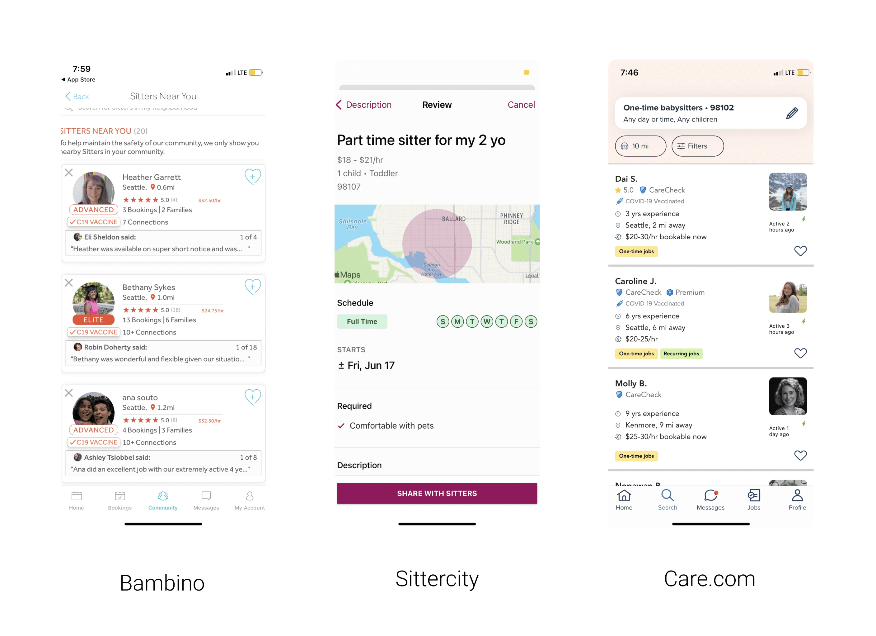
Most of them require parents to create a "job post" with all the details and wait until nanny applies to the job.
All of them show nanny profiles as a list.
Filters are provided through icons for easy recognition.
RESEARCH INSIGHTS
Endless searching process
Each time parents looked at a profile they needed to go back to the search screen, and repeat this process until finding a good fit.
Uncertainty
When posting a job, parents needed to wait to be contacted by caregivers, this process could have taken hours.
Visual clutter
Extensive information displayed on screen, increasing cognitive load and distracting user from main task.
HOW MIGHT WE
How might we help parents in booking a childcare service without overwhelming them with too many options and details?
REDEFINING THE USER FLOW
Since most of the parents relied on the app for last minute babysitting, they didn't have time to wait until the caregivers applied to the job post, so entering the details before hand and sending an inquiry to preferred nannies was the best solution to this problem.

FIRST EXPLORATIONS
With the first round of sketches, I realized that creating an instant match was not possible right away. This was because, for it to happen, the nanny would have needed to agree to the job arrangements at that point and there was not a screen designed for that purpose.
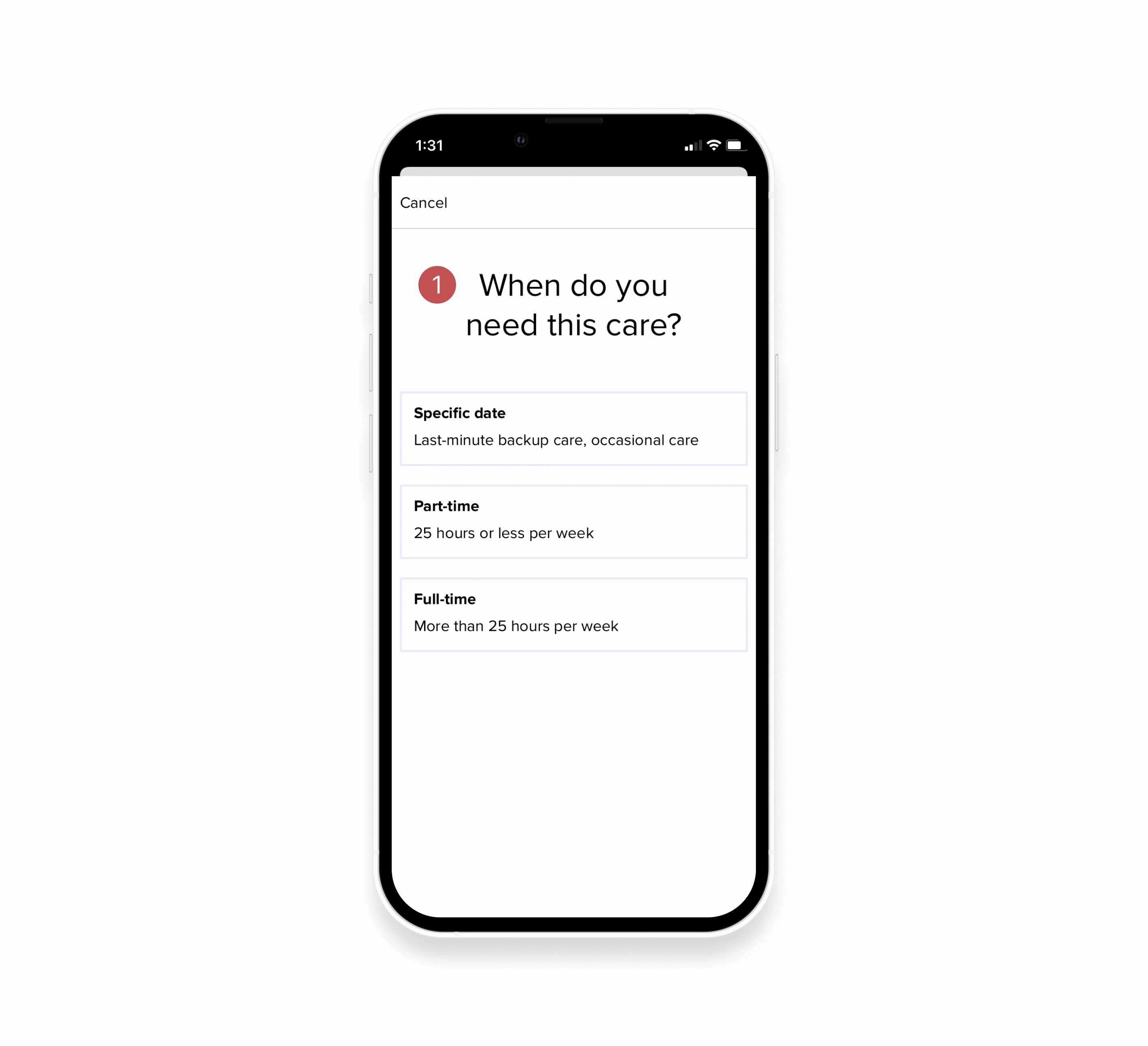
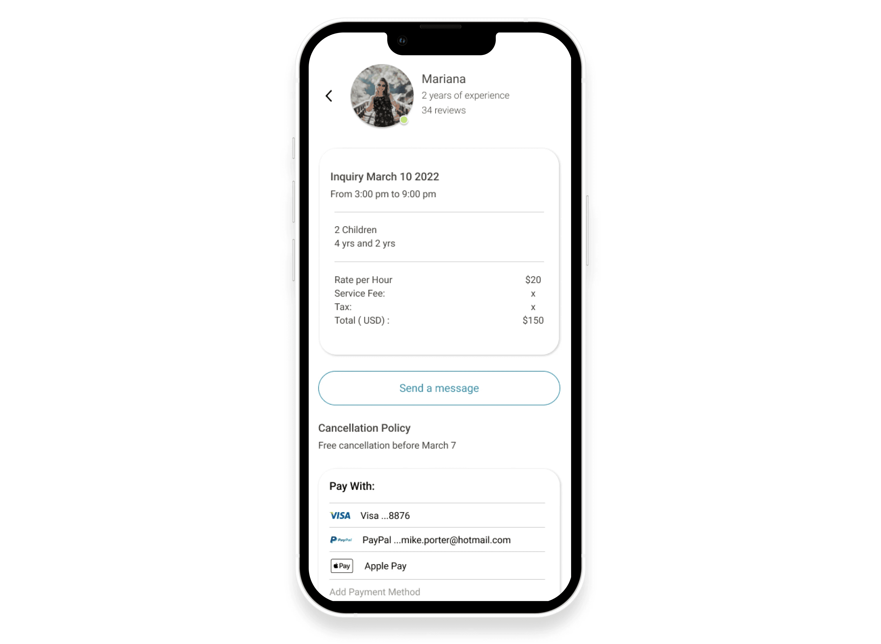
In the second iteration, I introduced an "Inquiry" screen, which would be automatically generated with all the preferences and job details. The user would have the opportunity to continue browsing for more "Nanny options", and once the Nanny accepted the inquiry, a pop up notification would be sent to the user, initiating the Confirmation and Booking Process.


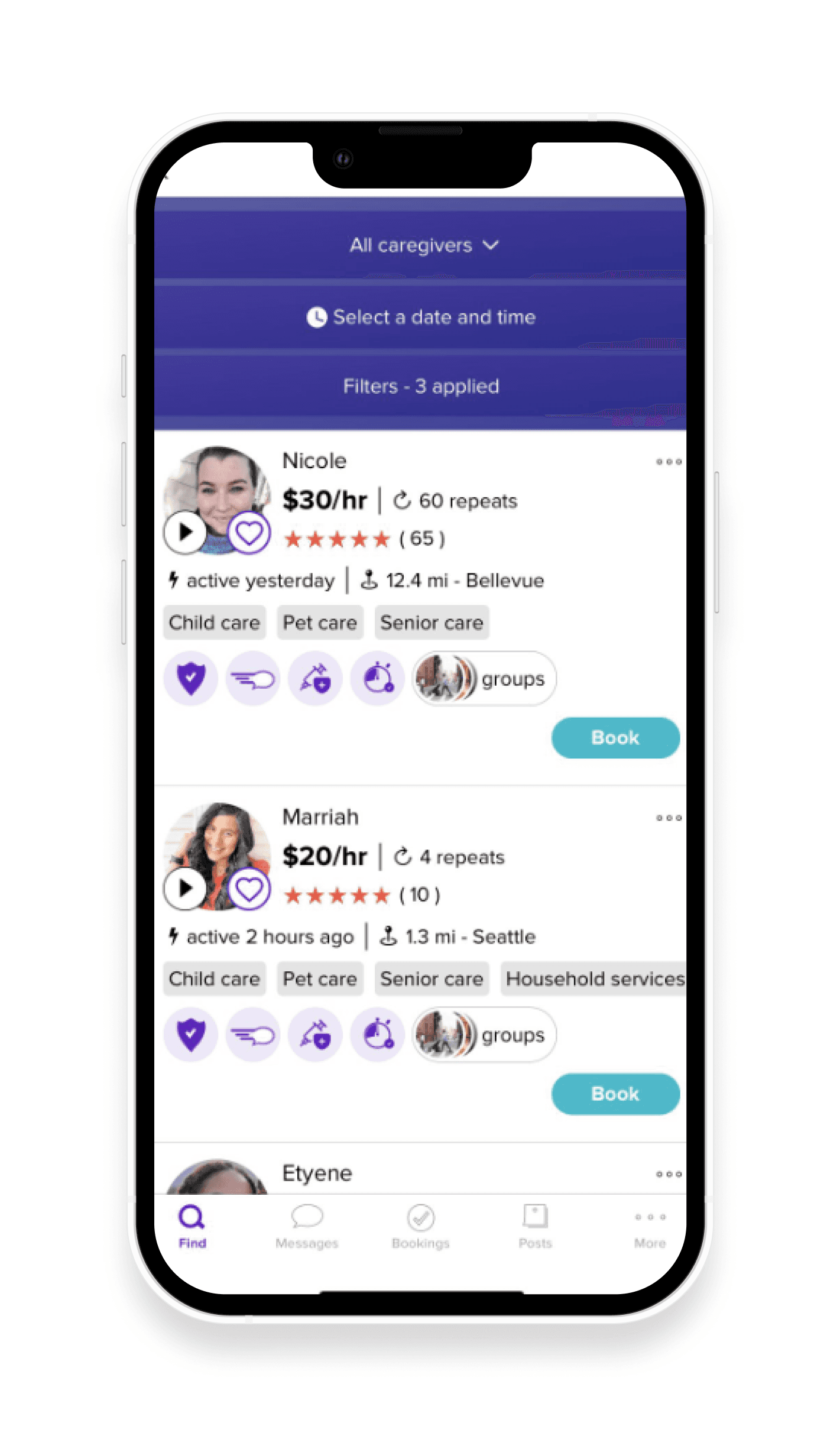
THE NEW FLOW AND HIGH FIDELITY DESIGN
After making a quick test with a few users and getting feedback from the first round of sketches, I started to work on the high fidelity designs and a clickable prototype to test the solution. The new flow was compiled into six clear steps, each of them addressed the main pain points discovered through research. The endless searching process was fixed by a swipe interaction through prospects, while the uncertainty issue was improved by allowing users to send inquiries to potential caregivers. All these changes create a more intuitive a user-friendly way for users to complete the main task.

EVALUATING THE RESULT
Final usability test
After finishing the second round of iterations, I conducted a final usability test with 3 participants, this helped me to test if the interactions and features added eased the experience and where to keep improving the design.
3/3 users were able to finish the task "book a nanny for tonight"
1/3 users had issues with the "additional tasks" filters in the search, they would have preferred it to be words instead of icons
3/3 users thought the swiping interaction was fast, easy and intuitive for them, and also effective for navigating through nanny prospects.
Key learnings
Having less screens is not always effective: I wanted to create a experience for users that was easy and quick to do, like "Swiping in Tinder", but with my usability tests I learned that there were some screens that were required for the user in order to understand what is their status on the process and the next steps to follow. That is why I decided to include the "Send inquiry screen".
Users appreciate having a saved items section, in this case the "favorites" section I added was valued during the usability tests I conducted.
Having peer reviews during the design process helps to get different perspective and useful feedback of what is working and what could be improved.