Amazon Prime Video

Amazon Prime Video

Simplifying Content Selection and Navigation in APV | 12 weeks

Role

UX Designer & UX Researcher

Tools

Usertesting, Figma

OVERVIEW

Amazon Prime Video is a video streaming service with a huge library of on-demand and rental content, offered as part of Amazon's Prime Subscription. For this class project, we were tasked with improving the usability for Amazon Prime Video, to give customers an enhanced user experience.

THE PROBLEM

Subscribers are experiencing difficulty differentiating content on the Amazon Prime Video from Amazon Prime regular website. They spend a significant amount of time selecting a movie from the homepage because there are too many elements on the screen competing for attention. This often results in site abandonment.

HMW

How might enhance the user experience on Amazon Prime Video to make it easier for subscribers to pick content, navigate the site and reduce confusion within the platform.

IMPACT

We are projecting an increase in the overall revenue of APV and brand loyalty with the changes done to the website.

THE SOLUTION

We suggested the incorporation of additional features to enhance users' overall experience on the site. These additions aim to provide a seamless journey for users, from signing into Amazon Prime, navigating through Amazon Prime Video, to selecting and filtering content to watch.

STANDALONE WEBSITE

My migrating APV platform to it's own webpage, we can increase credibility and reduce confusion.


The new "GO TO AMAZON PRIME" button on the nav bar would allow users to transition swap smoothly between websites.

STANDALONE WEBSITE

COLLECTIONS

My migrating APV platform to it's own webpage, we can increase credibility and reduce confusion.


The new "GO TO AMAZON PRIME" button on the nav bar would allow users to transition swap smoothly between websites.

Added a collections section where users would have the opportunity to group and save their favorite content and look at it later.

TOOGLE TO FILTER CONTENT

Included a toggle in the home page that allows users to quickly filter Prime content from Paid Viewing options in order to avoid irritation and frustration.

Fixed Watchlist discoverability issue by moving it out to the options bar and renaming it from "My Stuff" to "My watchlist".

COLLECTIONS

Added a collections section where users would have the opportunity to group and save their favorite content and look at it later.

TOOGLE TO FILTER CONTENT

Included a toggle in the home page that allows users to quickly filter Prime content from Paid Viewing options in order to avoid irritation and frustration.


Fixed Watchlist discoverability issue by moving it out to the options bar and renaming it from "My Stuff" to "My watchlist".

Clear indication is given to the user at all times regarding their location within the site

The website lacks clear indicators for users to track their progress or navigate backward and forward in their journey.

Appropriate user experience metaphor has been used

While the layout for the available drop down menus for users is fine, the content and order seems entirely chaotic. It diverges from the traditional order followed by other popular streaming services

Interactions are consistent and expected with users

If a user returns to the home screen and searches directly for a previously considered movie, they'll be directed to a screen displaying search results resembling the traditional Amazon website.

Cues are present to guide users through their workflow

While icons explain that some content is included and some isn't, there is not a way for users to filter this content for a faster search.

My design process

0.1 UNDERSTANDING THE PROBLEM

The first task we tackled in this project was conducting a Heuristics Evaluation. This helped us to determine if the site effectively supported user mental models, provided situational awareness, and aligned with user goals. This was the task we followed for this test: Find the “Recently Added Movies” section and then choose one movie from the options that interests you. Read more about the movie in the description section and find what your viewing options are for that movie.

Clear indication is given to the user at all times regarding their location within the site

The website lacks clear indicators for users to track their progress or navigate backward and forward in their journey.

Appropriate user experience metaphor has been used

While the layout for the available drop down menus for users is fine, the content and order seems entirely chaotic. It diverges from the traditional order followed by other popular streaming services

Interactions are consistent and expected with users

If a user returns to the home screen and searches directly for a previously considered movie, they'll be directed to a screen displaying search results resembling the traditional Amazon website.

Cues are present to guide users through their workflow

While icons explain that some content is included and some isn't, there is not a way for users to filter this content for a faster search.

USER TESTING

Tool: UserTesting

Testing Pool: 9 Full Time Students / 19-24 years old, 55% Women, 45% Men, 77% Make less than $19,999 per year, Live in the United States. Use Streaming services on a Daily Basis.

Task Flow:

  1. Log into Amazon Prime- Find amazon prime video

  2. Navigate Amazon Prime Video home page

  3. Find three movies and add them to your watchlist

  4. Go to watchlist and review your selections

  5. Remove one movie selection from your watchlist

  6. Choose one movie and Explore Details

Findings

Finding the APV Website: The way users find the APV website varies from person to person.

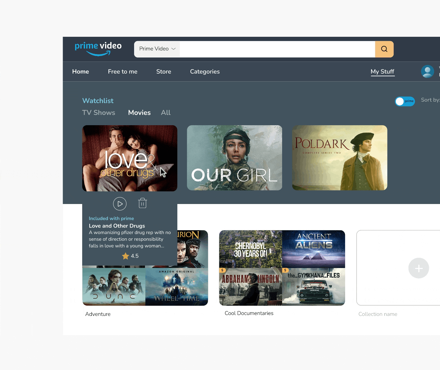
Terms aren’t Intuitive: ”My Stuff” is not intuitive for finding watchlist.

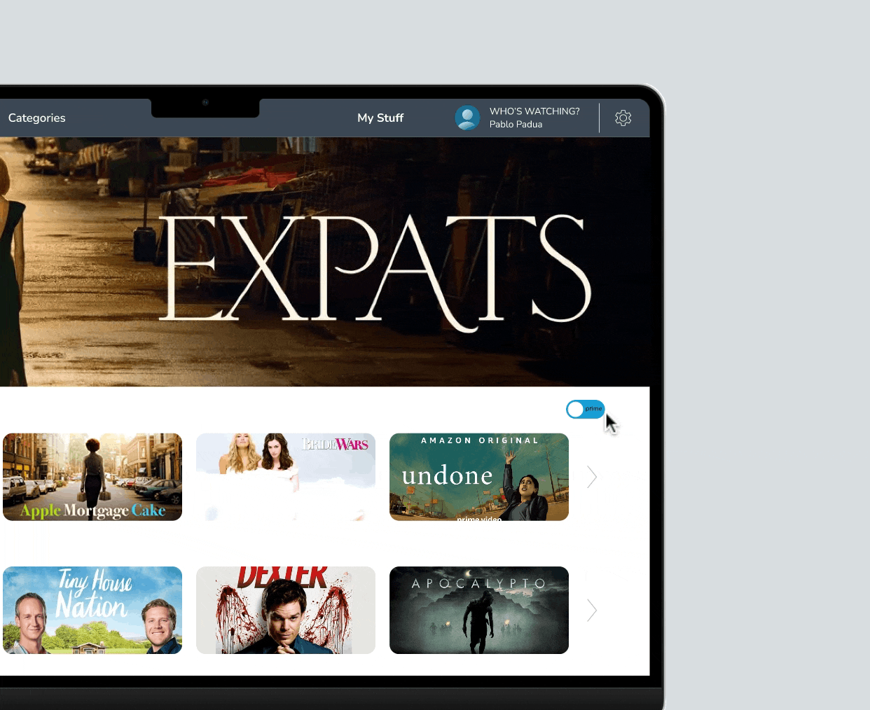
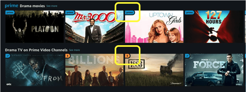
Mixture of paid & free content: The free movies and the paid movies are listed together in one category.

Too many categories: Struggling with amount of categories. It takes a lot of time to scrolling through.

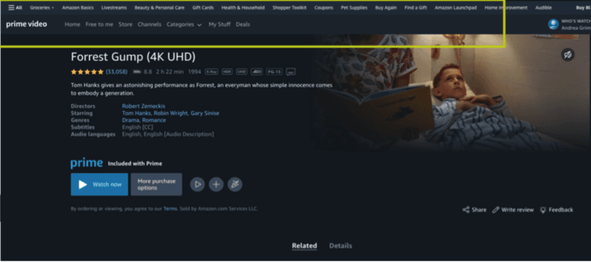
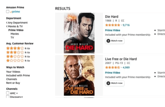
Confused by regular Amazon page: The items of regular Amazon are included in APV search result.

"It seems TACKY."... "It's bizarre

how I can get a coupon to buy a

bed while I'm trying to watch a movie. I feel like I'm in a deli."

User 3

"It seems TACKY."...

"It's bizarre how I can get a coupon to buy a

bed while I'm trying to watch a movie. I feel like I'm in a deli."

User 3

It is little upsetting when you

find something you want to

watch but you have to pay for it even though you have Prime.

User 6

It is little upsetting when

you find something you

want to watch but you have to pay for it even though you have Prime.

User 6

I'm confused with the search

bar, cause it sometimes gives

me the search results from all Amazon, not the Prime Video.

User 8

I'm confused with

the search bar, cause

it sometimes gives me the search results from all Amazon, not the Prime Video.

User 8

HOW MIGHT WE

How might enhance the user experience on Amazon Prime Video to make it easier for subscribers to pick content, navigate the site and reduce confusion within the platform?

0.2 IDEATING SOLUTIONS

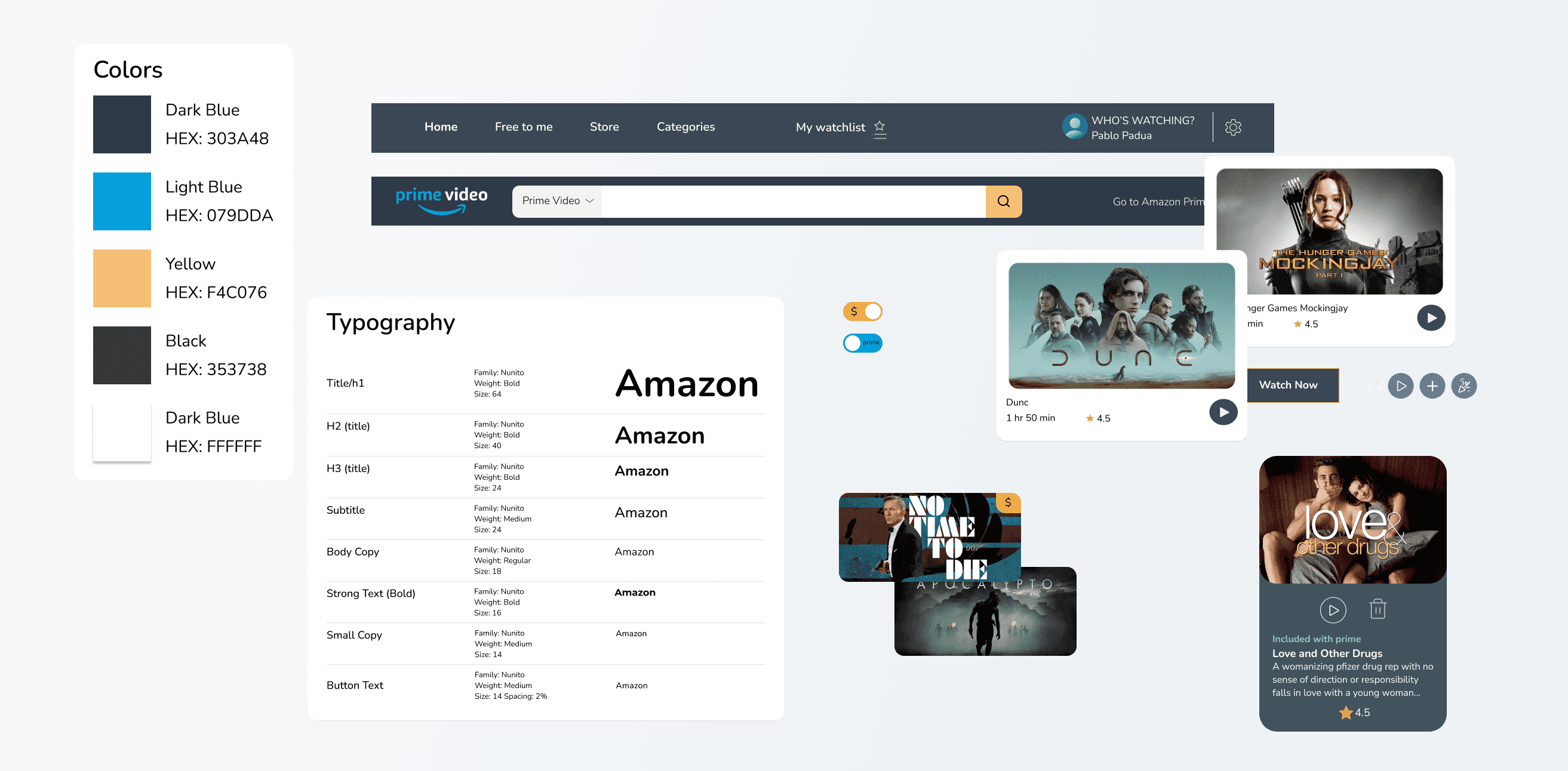
After brainstorming solutions, I started to work on the wireframes and hi-fidelity designs for the home page, and the proposed collections page. The color choices and typography were consistent with Amazon's established branding.

Key learnings

  • I learned that users value websites were content looked declutter and clean.

  • I learned that small improvements like improving the Toggle feature to differentiate the "Paid content" from the "Pay per view" content, could make a huge impact in the navigation of a website.